A product page checklist that helps customers make better buying decisions
Build product pages around questions, evidence and low-friction decisions instead of decorative conversion tricks.
- Author
- Víctor Ribera
- Published
- Reading time
- 7 min read
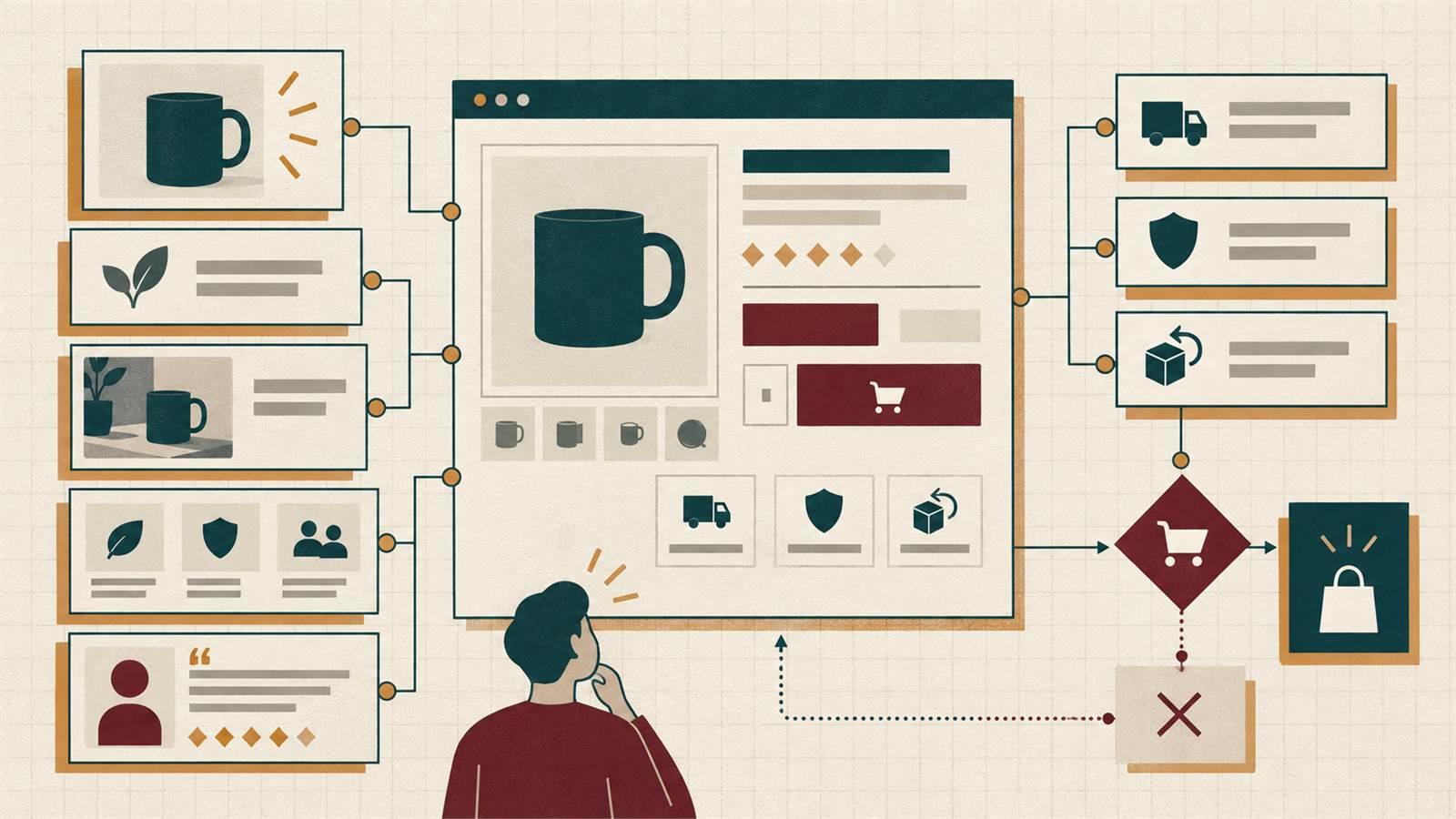
A product page has one demanding job: help a customer decide whether a specific product is right for them. The page must create desire, but it must also resolve practical uncertainty about fit, materials, delivery, returns and use.
Many product pages focus on the purchase button while leaving the decision unsupported. The result is hesitation, abandoned sessions, avoidable customer-service questions and returns. The checklist below treats conversion as the outcome of better information and interaction.
Make the product identity unambiguous
The title, variant, price and primary image should confirm immediately that the visitor reached the expected item. Avoid internal product names that make sense only to the team. If products are similar, explain the difference in the title or a short descriptor.
Keep promotional labels subordinate to the product identity. A stack of badges, crossed prices and campaign messages can make the main information harder to scan.
- Descriptive product name
- Current price and relevant tax information
- Selected variant visible near the title
- Availability stated without vague urgency
Use imagery to answer questions
Images should show more than appearance. Include scale, texture, important details, packaging and the product in context. For products where fit matters, use consistent angles and explain model or object dimensions.
The gallery must remain usable with touch, keyboard and zoom. Large files should be transformed into appropriate responsive sizes so that visual evidence does not become a performance penalty.
- Consistent main image ratio
- Detail and context images
- Useful alt text for meaningful images
- Video only when it adds information
- No critical information embedded only in images
Write descriptions for decisions, not search engines alone
A useful description connects features to situations. Material specifications matter, but customers also need to know how the product feels, what it solves and what trade-offs to expect. Avoid repeating the same generic paragraph across every item.
Structure longer information with short sections or accordions, but do not hide the information most likely to affect the purchase. Search visibility and customer clarity usually improve together when the content is specific.
- Concise value summary near the top
- Detailed specifications in a scannable format
- Care, compatibility or usage guidance
- Clear limitations where they prevent a wrong purchase
Design variant selection as a state, not a mystery
Colour, size, material and configuration selectors must show what is selected and what is unavailable. Updating a variant should update the image, price, stock and URL where appropriate. Preserve the selection when the customer returns from the basket.
Do not rely on colour swatches without text labels. People interpret colours differently, screens vary and assistive technology needs a meaningful name.
- Visible selected state
- Disabled options explained
- Variant-specific price and stock
- Text labels for visual swatches
- Shareable URL for important configurations
Put delivery and returns before the point of anxiety
Customers often postpone the purchase because delivery cost or return conditions are unknown. Linking to a policy in the footer is not enough. Show a concise, relevant summary near the purchase area and provide the full details without losing the product context.
Where possible, estimate delivery using the customer location and current stock. Be precise about dispatch versus arrival dates. For international sales, clarify duties and restrictions.
- Expected delivery range
- Shipping threshold or cost
- Return window and important exclusions
- Store pickup or alternative fulfilment options
Use trust evidence that belongs to the product
Reviews are valuable when they help a customer understand fit, durability or use. A large rating without context is weaker than a smaller set of detailed, verified reviews. Questions and answers can address recurring uncertainty and create useful content for future visitors.
Claims about sustainability, guarantees or certifications should link to specific evidence. Generic trust icons copied across every page can reduce credibility when they are not explained.
- Review count and distribution
- Filters for relevant review attributes
- Clear verification method
- Product-specific guarantee information
- Accessible disclosure of sponsorship or incentives
Make the purchase action clear and resilient
The primary action should remain easy to find without dominating every part of the page. When a product requires a selection, the interface should explain what is missing instead of failing silently. After adding to the basket, confirm the item and offer a clear next choice.
Sticky purchase bars can help on long mobile pages, but they should not cover content, cookie controls or accessibility tools. Test them with zoom and small screens.
- Action label reflects the real result
- Required choices identified before submission
- Loading and error states are visible
- Basket confirmation preserves context
- Keyboard focus moves predictably
Protect performance and measurement quality
Product pages often carry galleries, recommendations, reviews, personalisation, chat and several tracking vendors. Each feature may look small in isolation but together they can delay the main content and make interaction unstable.
Prioritise the product image, title, price and purchase controls. Load secondary widgets when they approach the viewport and measure whether they support revenue or only add complexity. Analytics should distinguish product views, variant choices, validation errors, add-to-basket and purchase outcomes.
- Responsive images and explicit dimensions
- Limited third-party scripts
- Stable layout while media loads
- Events tied to meaningful funnel decisions
Review the page as part of a journey
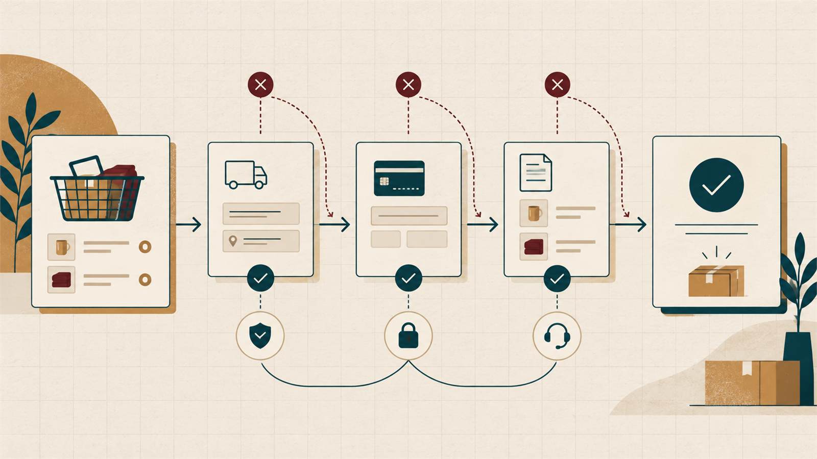
A strong product page cannot compensate for misleading category filters, unclear search results or a difficult checkout. Test the journey from discovery through comparison, product decision, basket and payment.
Use customer-service questions, return reasons and on-site search terms as research. They reveal information that the page is missing and often provide a more useful roadmap than copying competitors.
- Test common entry routes
- Compare similar products clearly
- Preserve state when navigating back
- Feed support and return insight into content improvements
Design for comparison without forcing a new tab
Customers rarely evaluate one item in isolation. Keep comparable specifications in the same order, make units consistent and allow people to move between alternatives without losing filters or scroll position. For complex products, a lightweight comparison tool can reduce memory load.
Recommendations should explain the relationship. “More from this collection” is less useful than showing a compatible accessory, a lower-cost alternative or the model with a specific extra capability. Clear comparison supports confident choice and reduces random browsing.
- Consistent specification order
- Meaningful differences highlighted
- Back navigation preserves filters and position
- Recommendations labelled by their purpose
Plan for edge cases before the catalogue grows
Out-of-stock, discontinued, preorder, personalised and bundle products need intentional states. Hiding a product can waste existing search visibility and frustrate customers following saved links. Where appropriate, keep useful information visible and provide an alternative or availability notification.
Define how pricing, promotions and regional restrictions behave before campaigns create pressure. A stable product template should accommodate exceptions without filling the interface with messages that apply to only a small group of visitors.
- Useful out-of-stock state
- Replacement or alternative product
- Preorder timing and cancellation terms
- Region and currency restrictions explained
Help the customer choose well
The most reliable product-page improvements reduce uncertainty. Present the product clearly, answer practical questions, make variants and fulfilment understandable, and keep the interaction fast and accessible.
A customer who makes a well-supported choice is more likely to complete the purchase, need less support and remain satisfied after delivery.