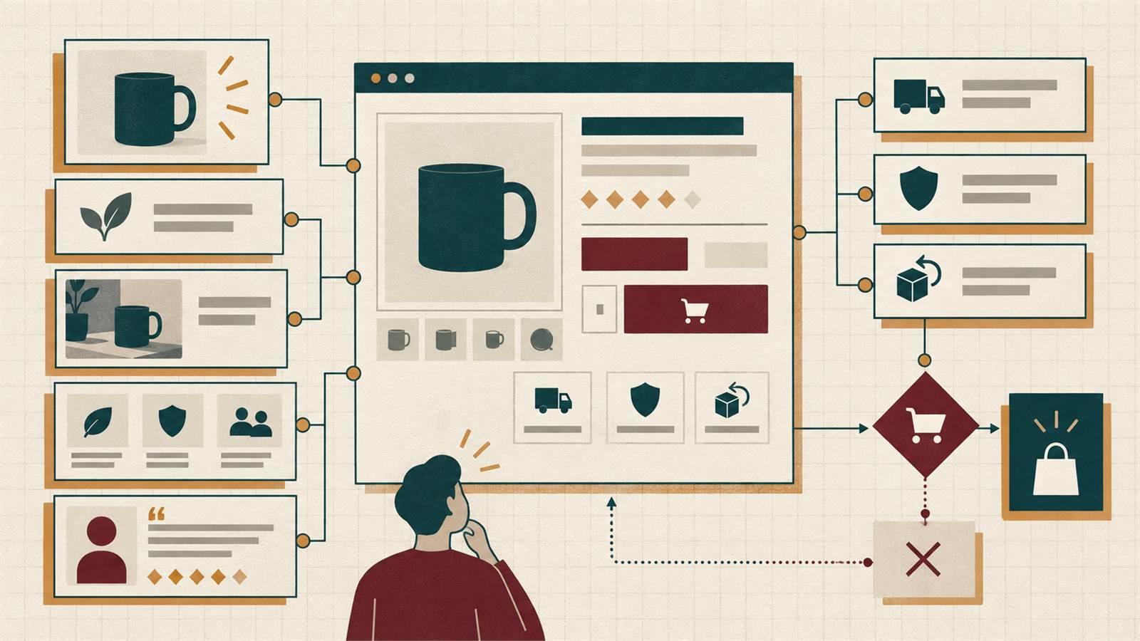
How to reduce friction in an e-commerce checkout
Improve completion by removing uncertainty, unnecessary work and avoidable errors across the entire buying journey.
- Author
- Víctor Ribera
- Published
- Reading time
- 2 min read
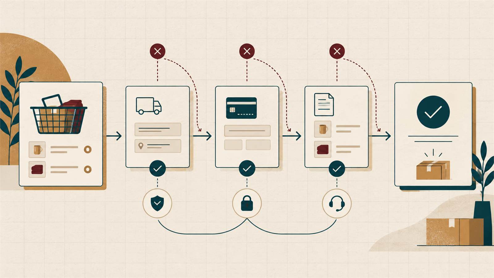
Checkout friction is any uncertainty, work or error that makes completing a purchase harder than expected. It can start before the checkout itself: unclear delivery information, inconsistent pricing or a cart that loses state.
The goal is not to remove every step. It is to make each required step understandable, predictable and recoverable.
Set expectations before checkout
Show relevant delivery regions, timing, returns and tax information before the customer commits. Surprise costs or unavailable delivery options create distrust at the most sensitive moment.
Keep the cart summary clear and update totals immediately when quantity or shipping changes.
Allow a direct path to purchase
Do not force account creation before payment unless the business model genuinely requires it. Guest checkout can be followed by an optional account creation step using the information already entered.
Keep distractions lower than on catalogue pages, but preserve access to help, delivery and return information.
Reduce form effort without hiding meaning
Ask only for data needed to fulfil, pay for or legally process the order. Use appropriate autocomplete attributes, input types and clear labels.
Do not rely on placeholder text as the label. Validate near the field and preserve valid input when another field has an error.
- Use one name field only if operations allow it
- Offer address assistance without blocking manual entry
- Explain why unusual information is required
- Match field order to local address conventions
Make errors easy to recover from
An error message should identify the problem and the next action. “Something went wrong” forces customers to guess.
Payment failures need special care: keep the basket and entered data, explain whether the charge occurred and offer a safe retry or alternative method.
Test the journey on real mobile conditions
A checkout that fits a desktop screenshot may fail with a mobile keyboard, password manager, payment handoff or slow connection.
Test common devices, long names and addresses, failed payments, back navigation and returning to an interrupted cart. Watch users complete the journey rather than only reviewing screens.
A good checkout feels uneventful
Customers should spend attention on the purchase, not on understanding the interface. Remove surprises, keep progress visible and design recovery paths as carefully as the ideal path.