Why your website gets traffic but no enquiries
Visitors are arriving, but the inbox stays quiet. Trace the journey from the first click to a real enquiry before buying more traffic or rebuilding the website.
- Author
- Víctor Ribera
- Published
- Reading time
- 6 min read
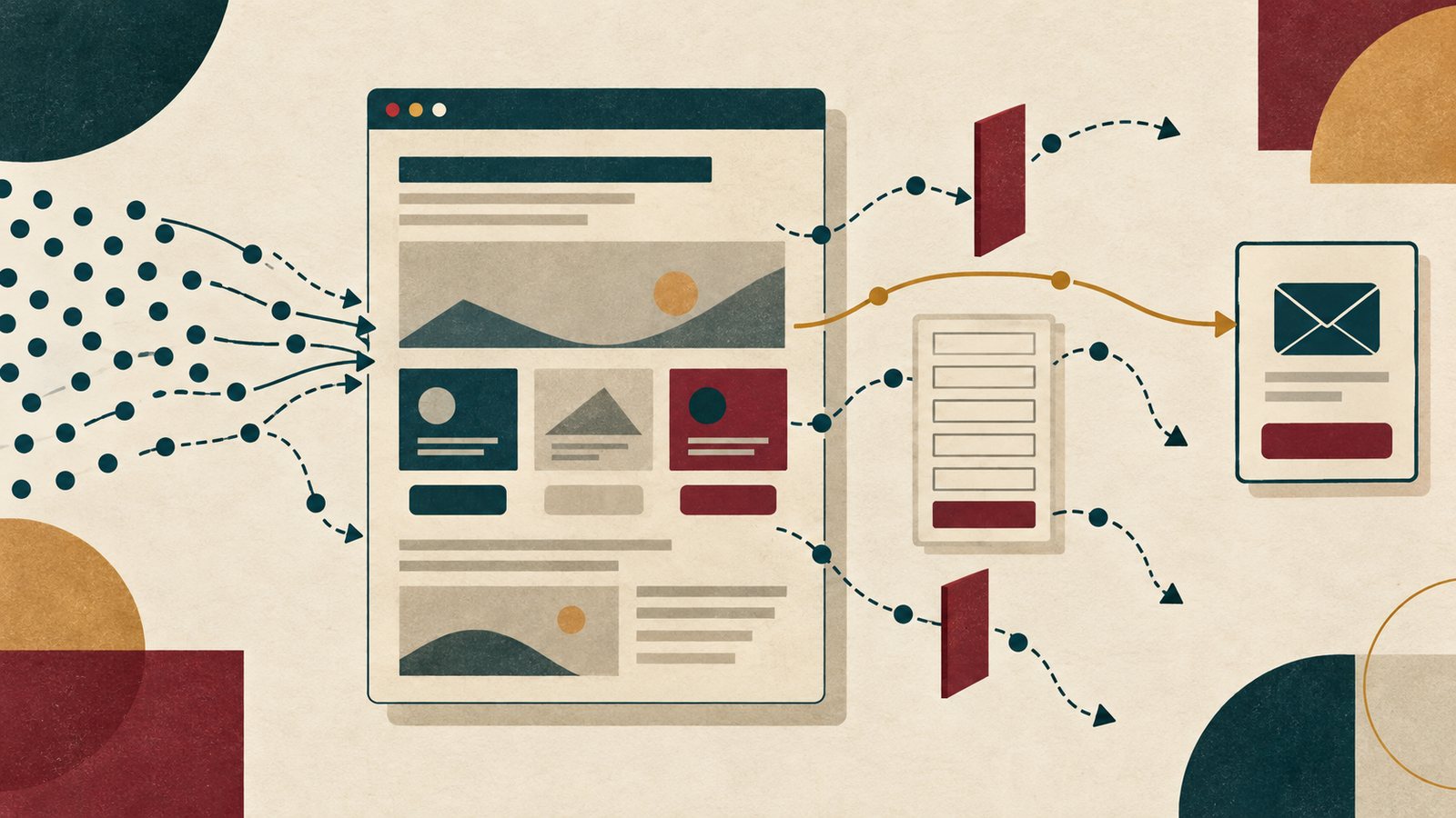
Your analytics show visits. People reach the homepage, open service pages and sometimes spend time reading. Yet very few enquiries arrive. It is tempting to conclude that you need more traffic, a louder button or an entirely new website.
Start by finding where the journey stops. Traffic is useful when the right visitor can understand the offer, trust the business and take a clear next step. A weakness anywhere along that route can leave a busy website with a quiet inbox. Identify that weakness before choosing a solution.
First, check what “no enquiries” actually means
Send a test enquiry from the live website and follow it all the way to the inbox or CRM. Check the confirmation, spam folder, notification recipient and reply process. A form that displays success while delivery fails is a different problem from a visitor deciding not to contact you.
Compare recorded submissions with real conversations, including phone and email. A contact-button click shows intent, not a completed enquiry. An enquiry is not automatically a qualified lead either. Define the outcome that matters before using a conversion rate to judge the website.
- Confirm delivery and who handles replies.
- Separate contact clicks, successful submissions and relevant enquiries.
- Check whether analytics are missing events or counting them twice.
Look at the visit you received, not just the total
A visitor reading an explanation is not necessarily ready to buy. Existing customers, job applicants and people outside your service area may all appear in the same traffic total. Separate the main landing pages by source, device and likely purpose before calling the whole site ineffective.
For organic search, Search Console shows queries and pages receiving clicks. Compare the question with the answer on the page; the report does not tell you whether someone became a lead. For campaigns, compare the advert with its destination. A promise of a specific service followed by a general homepage asks the visitor to restart their search.
Imagine a local accountant attracting readers to an article about filing dates. Those readers may only need a deadline. Someone looking for bookkeeping support needs service scope and a relevant next step. This is an illustrative situation, not a client case study.
Read the page without your own background knowledge
Read the opening heading and first paragraph before judging the design. Can you explain what the business does, who it helps and why the offer fits this visitor? “Solutions for your future” may sound confident while leaving all three questions unanswered.
Explain what the service involves, where it is available, what the client needs to provide and any meaningful limits. If price depends on scope, explain what shapes the estimate. Do not make visitors enquire just to discover whether the offer is remotely suitable.
A page addressing homeowners, enterprise buyers, partners and job applicants equally can lose its main thread. Give the primary audience a clear route and let others find their destinations through descriptive navigation. The aim is a coherent decision, not fewer pages at any cost.
Put reassurance where the doubt appears
People can understand an offer and still hesitate. They may wonder whether you have done similar work, who will handle the project or what happens after contact. Answer the doubts relevant to this service.
Use genuine examples with context, attributable testimonials used with permission, accurate credentials and a clear process. Do not invent results or substitute generic trust badges for evidence. If you cannot yet show a comparable project, explain the work and responsibilities honestly.
Hierarchy matters. Important reassurance buried below repeated slogans may never support the decision. Scan the headings in order: does the page explain the offer, resolve the main concerns and make the next step easy to find?
Make the invitation specific, then complete it yourself
“Learn more” can suit exploration, but says little about starting a conversation. Describe the action: request an estimate, discuss a project or book a consultation, when those are real options. Explain what information you need and what response to expect, without promising timing you cannot maintain.
Keep one primary action clear. A newsletter, download, booking prompt and contact invitation competing equally can make a service page harder to use. Secondary routes can remain available without interrupting the main one.
Complete the contact journey. Ask for information needed for the initial conversation; defer detailed specifications where possible. Use persistent labels, clear instructions and useful validation. W3C’s forms guidance supports these practices. Preserve entered information after errors, confirm successful submission and provide a recovery path when sending fails.
Test the journey on a phone, not only in a screenshot
Open a real entry page on a small screen and follow the route to contact. Check the menu, service links, readable text, tap targets and form with the keyboard open. Sticky controls, cookie notices and chat widgets must not obscure actions or fields. Repeat with keyboard navigation and zoom.
Check loading and responsiveness on a slower connection too. A delayed heading, shifting button or unresponsive form can interrupt the journey. Performance is one possible obstruction; a good speed score does not prove that the offer is clear. Diagnose the affected page before assuming the entire site needs rebuilding.
Choose one change supported by evidence
Record a simple route: relevant landing-page visit, contact action, form start, confirmed submission and qualified conversation. Verify event triggers in your analytics tool. In Google Analytics, an important action can be marked as a key event; that label does not guarantee its implementation is correct. Use your applicable privacy and consent settings, and keep form contents out of analytics events.
Treat patterns as questions. Few contact actions may indicate a mismatch or unresolved doubt. Form starts without submissions may suggest friction or a fault. Enquiries without useful conversations may point to expectations or follow-up. Analytics alone cannot determine which explanation is true.
Pick a priority journey, record the suspected problem and change the smallest relevant part. Compare similar sources and periods, noting campaign changes and small samples. Watch a few representative people attempt the task too. More traffic can help once the route works, but otherwise sends more people through the same obstruction.
- Unclear service: clarify the opening and scope.
- Unanswered doubt: add relevant, verifiable evidence.
- Broken contact path: repair and test delivery.
- Wrong visitors: review targeting and the landing-page promise.
Find the missing connection before adding traffic
A website that gets traffic but no leads needs a diagnosis of the enquiry journey. Start with delivery and measurement, then examine visitor fit, the offer, trust and the practical contact experience.
Some problems need a focused content or form improvement. Others reveal a broader structural issue. The related guides below help with redesign scope, editing constraints and cost when the diagnosis points there. Choose work around the obstruction you found, rather than treating a new website as the default answer.